I was asked for sample of things that I've designed, and realised I don't have an archive. So here is a selection of my own designs, some adaptations (considering the line is quite blurry on these things when you work as an artisan more than a designer) and some I've just made. Everything is annotated.
The list will probably grow as I go through my archives for design photos...
Printmaking and millinery now have their own pages!
The list will probably grow as I go through my archives for design photos...
Printmaking and millinery now have their own pages!
3D Printing
|
|
|
|
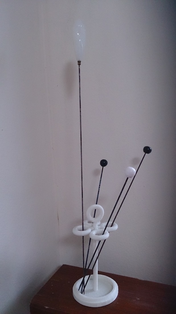
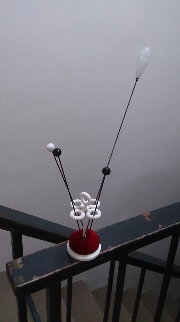
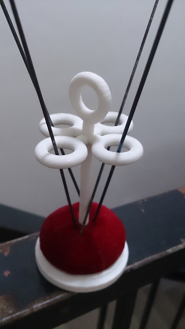
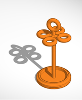
Hat pin stand, my first attempt at 3D printing. Designed in Tinkercad, it had to be scaled down by about a third to fit the available printer. The cushion is hand sewn of velveteen and stuffing on a cardboard base.
|
Laser Cutting (and some wood turning)
|
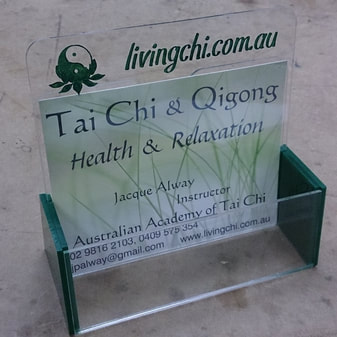
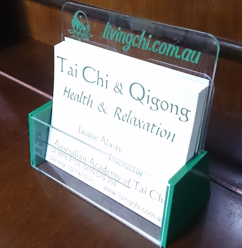
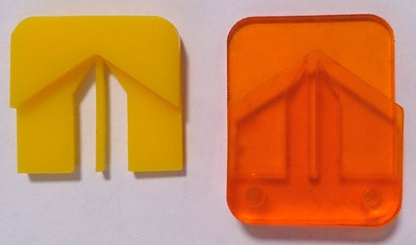
My mother asked me to make a custom holder for her postcard-size ads, so that they will be less likely to be disposed of at the health food shop. Here is the final product, complete with etched and hand painted heading. The back is indeed made of two separate layers of perspex, with a space between them for a couple of cards.
|
|
|
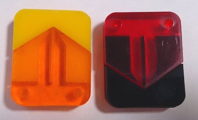
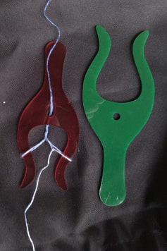
This is my button sewing gadget. Designed, laser cut and assembled. I'm working on improvements for Version 2, but this one works just fine anyway, creating a perfect shank when machine sewing any two-hole or four-hole button of reasonable size.
|
|
|
|
|
|
|
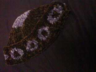
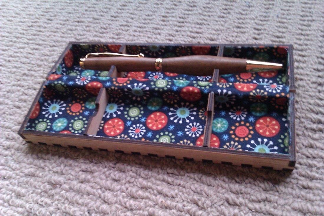
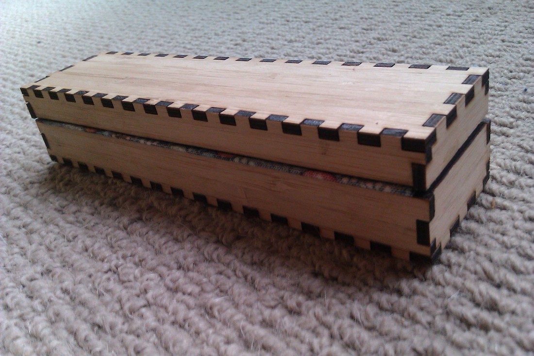
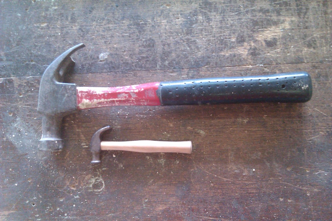
Lucets reproduced in perspex, turned pen in laser cut bamboo box with laser cut fabric lining which also forms the hinge. Turned handle for a miniature hammer head, with its model.
Tatting
|
|
|
|
|
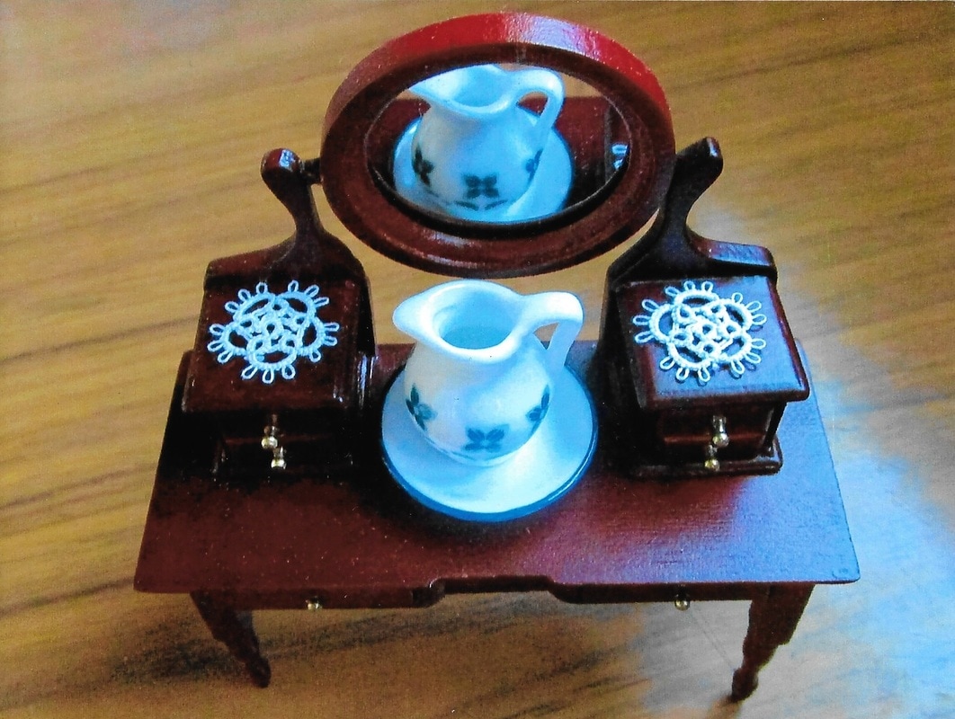
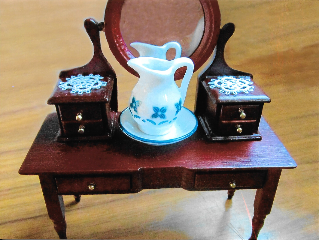
I was asked to make two doilies, with maximum diameters of 3/4", to suit a Victorian doll's house. Below, small pieces both freeform and from patterns.
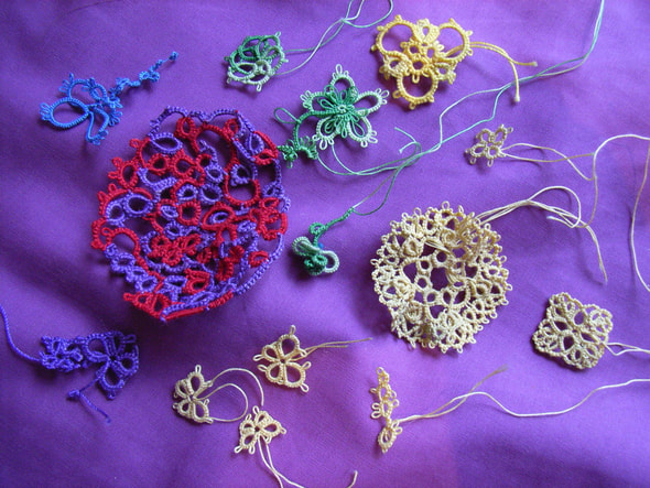
|
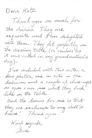
The postcard is from 2008, an art exhibition I participated in. I was definitely tatting, not sewing! On opening night I sat in a rocking chair in the shopfront window, tatting with climbing rope. I still hold out hope that one day I'll get a copy of the photos and video taken that night.
|
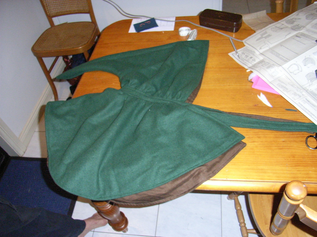
Dressmaking and costume
|
|
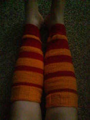
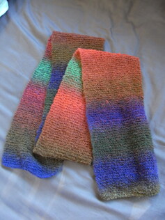
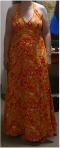
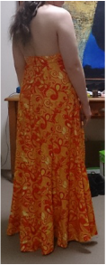
I've made six versions of this dress, so far. The orange paisley is the latest. They're all cotton prints, but they're adapted from a seventies dress of a similar shape, made of something ridiculous like nylon tricot. The best ones wear out, and I make more.
|
|
|
|
|
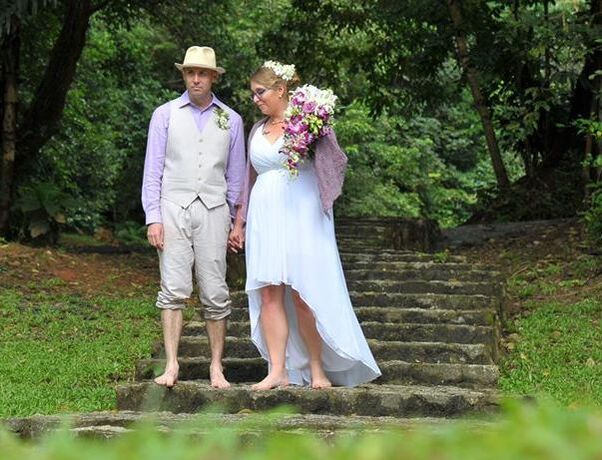
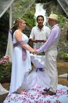
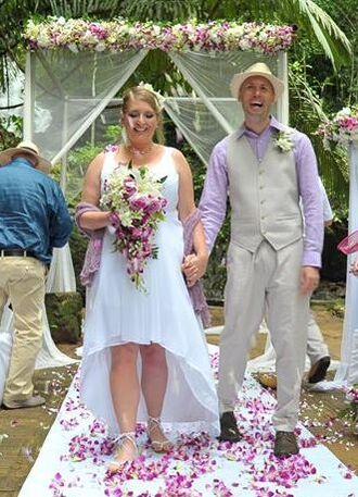
A friend's wedding dress needed some help. Originally the gathers in the front of the skirt meant that the raised hem fell away from a single point, a spike instead of an arch. I made the chiffon layer conform to the curve of the lining, and adjusted the shoulder straps so the bust fit correctly.
|
|
|
|
|
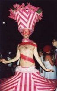
This is a costume commissioned by a friend for Sydney Mardi Gras in 2007. I designed and constructed it, including screen printing the stripes and colouring all those flowers! It was inspired by the lampshade frame and fake flowers we found at Reverse Garbage, which became the basis for the hat.
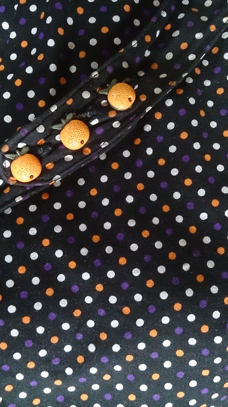
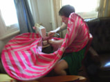
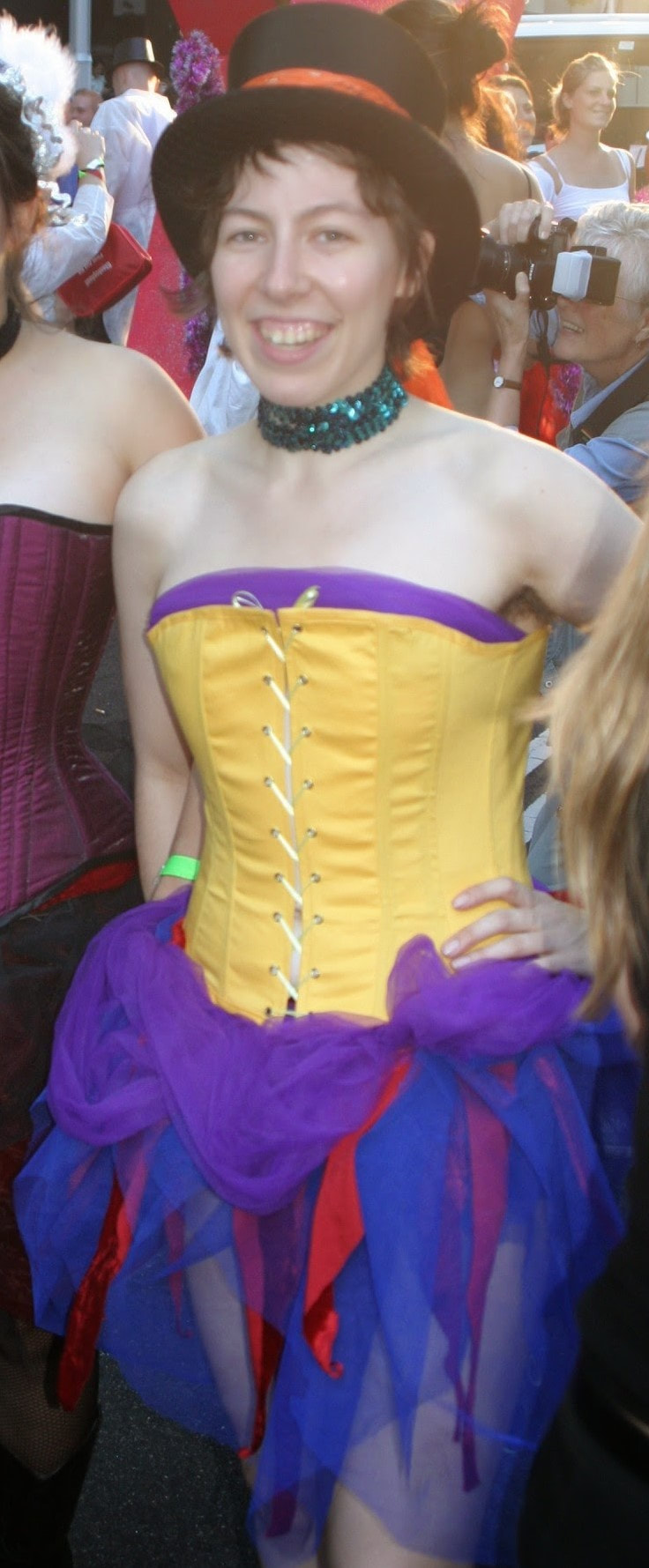
I cobbled together a costume for myself at the last minute, constructing the blue tulle skirt with red panne velvet scraps, attached to a stretch base. The draping was secured with giant upholstery pins and I was replacing them with hand sewing as I sat on the ground in Start Area. I still found the occasional pin for years after! I paired this with my light weight corset of yellow cotton and Rigilene boning. It was only ever meant to be a toile, but it was cheerful and comfortable, so became a real garment that night! The soft purple tulle was not attached. |
|
|
|
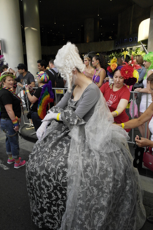
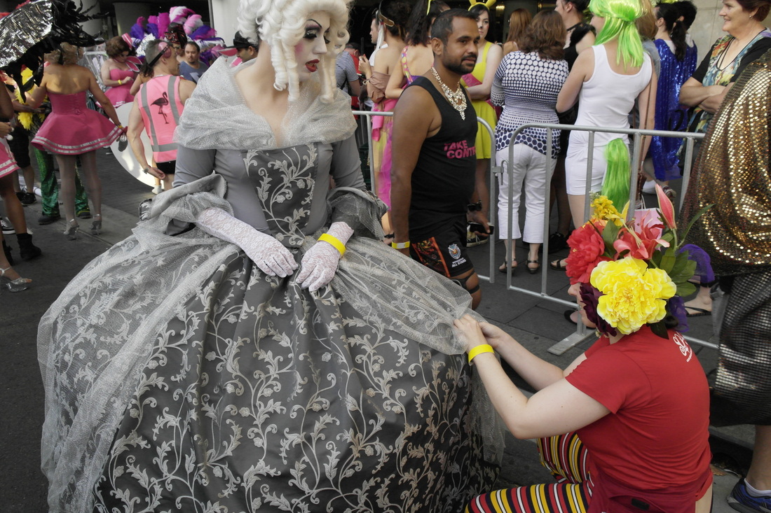
Marie Antoinette costume commissioned for Mardi Gras 2015. Parameters: comfort, frilly sleeves, eye catching, little skin showing. A first drag attempt. Hence the sad lack of corsetry and the even wider skirt to compensate!
|
|
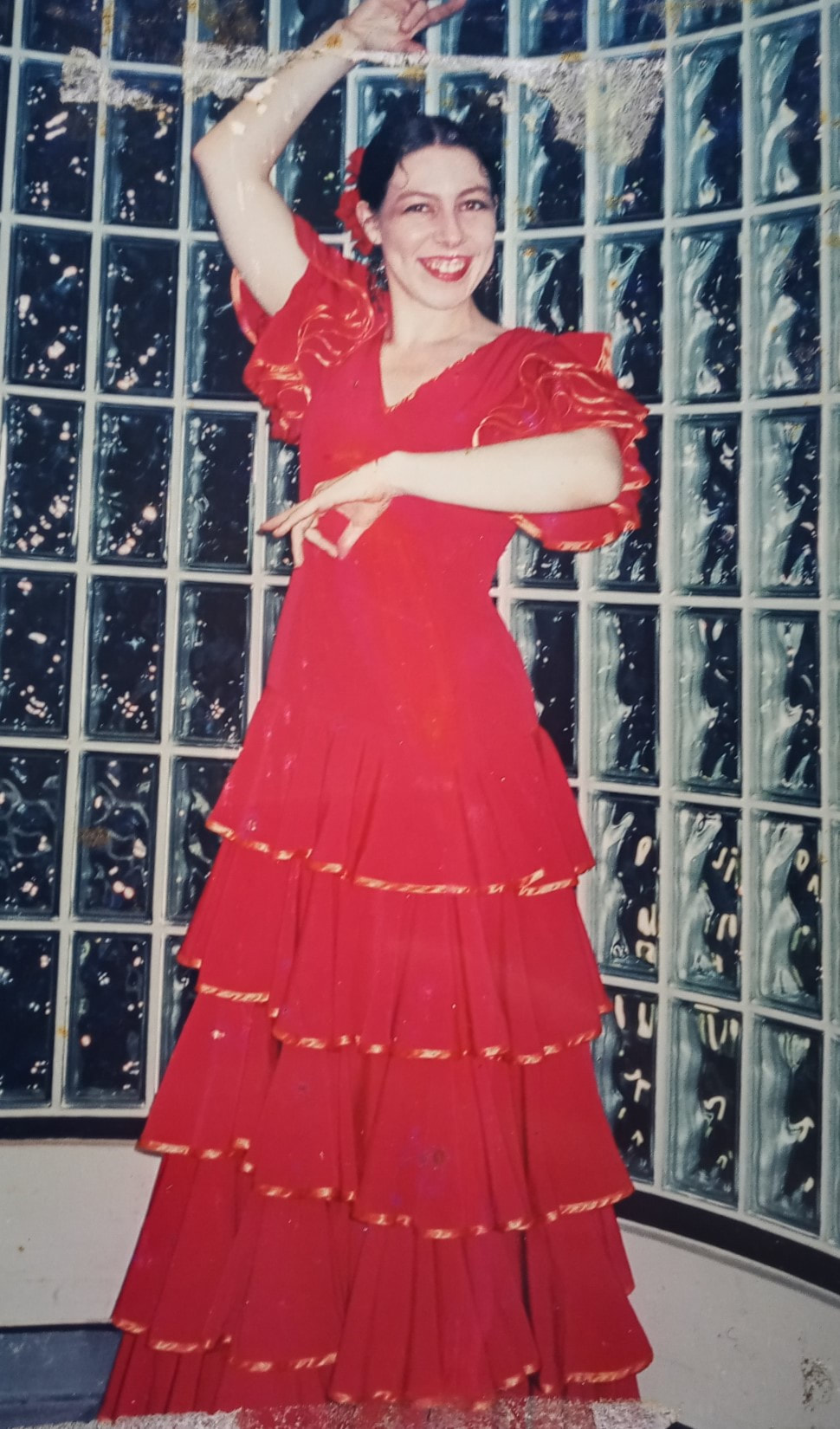
When I studied flamenco, I made three garments that I can recall - an amazing ruffly practice skirt, a less amazing skirt when I had no sewing machine and no resources in Denmark and this dress for the one concert I did, in Sydney, performing Sevillanas. It must've been 2003, so I was lucky to dig up this damaged old print photo.
The dress is made out of metres and metres of some thin, slippery synthetic stuff, with orange poplin lining the bodice and a whole roll of satin bias binding. I think everyone else in the class got the same dressmaker to make them for $300, but I made mine. I measured up one of theirs, so the ruffles are all the same, but mine has a fitted bodice which made all theirs look boxy. Still, they could breathe when they raised their arms in their boxy bodices, which must've been nice, considering your arms are up most of the dance! All the ruffles are circles. So, so many circles! The neckline has a cord threaded through the bias, with a bow at the back, above a long zip. There is a burnt bit somewhere in the lower frills, but with such a mass of fabric, it's hard to find even when you're looking at it, so I never did anything to it. |
|
|
This one I merely sewed up for a friend.
|
Woodwork
|
|
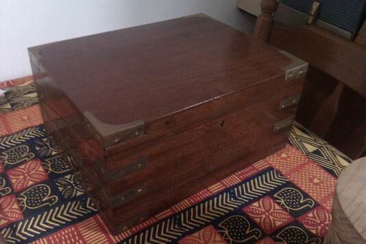
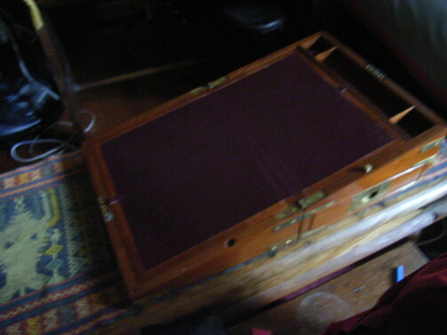
My escritoire. A slightly scaled down copy of the one made by the friend who guided me through the process. His was made from measurements taken from an original in a ship in England. I started it for my Design and Technology project in year 11, but didn't apply the final coat of varnish until eleven years later. It was a rather more ambitious project than I was meant to choose! It has four tiny, dovetailed hidden drawers amongst the various other spaces. I should really take some better photos!
Recycled Materials
|
|
|
|
|
|
|
|
|
|
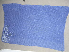
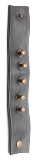
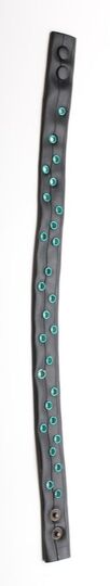
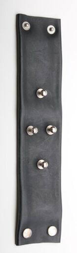
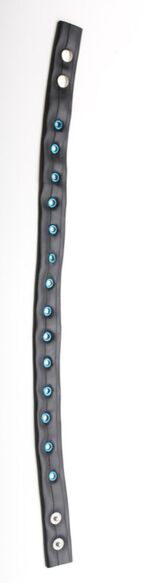
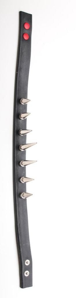
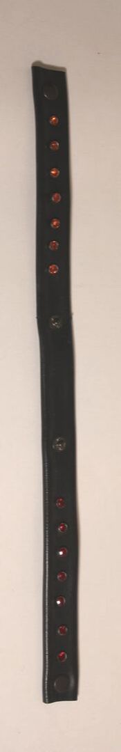
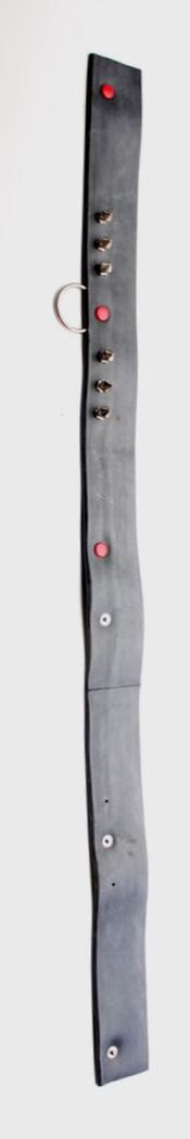
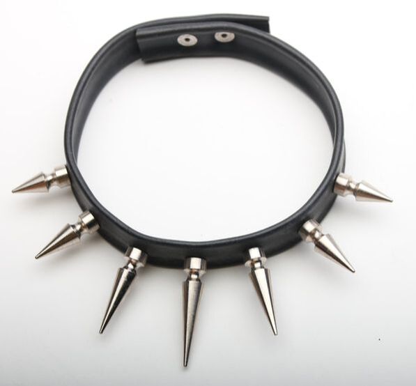
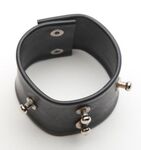
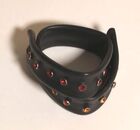
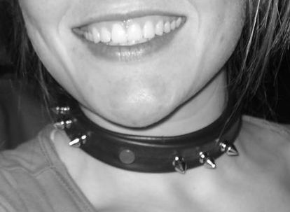
Recycled rubber inner tube jewellery - cuffs and collars.
Sculpting and casting
|
|
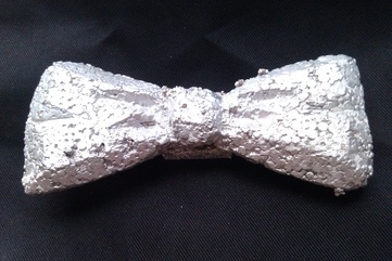
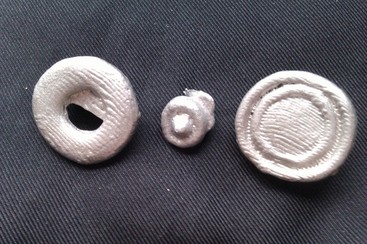
Polystyrene sculpted bowtie, cast in aluminium. An interesting project with shape constraints to allow it to cast properly, not break before or after casting, be light enough to wear around the neck and allow attachment points. While I was at it, I hand carved the negatives of a few buttons into cuttlefish and cast them too.
Upholstery
|
|
|
|
|
|
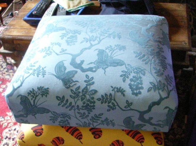
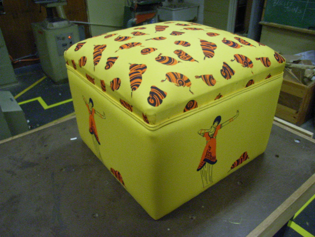
The footstool box was the first project in my wonderful upholstery course - an HSC subject, for adults, taught in a highschool's workshop at night. It's a crying shame the program didn't continue.
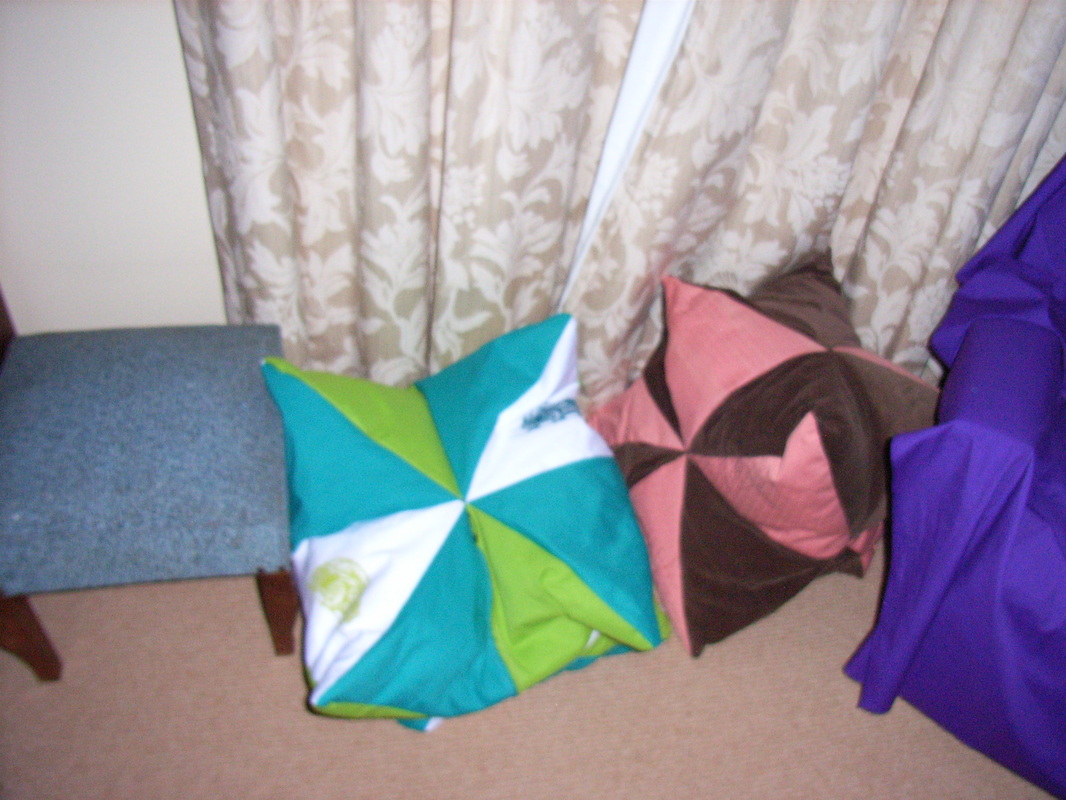
The second image is the only photo I can find so far of a couple of beanbag footstools I made. I've also done a couple of smaller, hard-stuffed cushions.
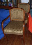
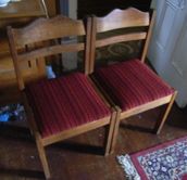
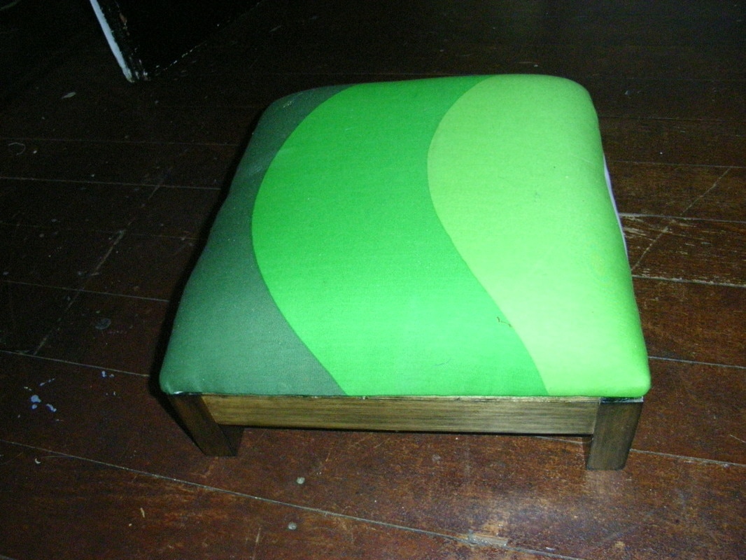
the four chairs are restored and reupholstered, the green footstool is a modern foam construction on top of a mortise and tenon frame with ply top that I made in year 10. The matching chair didn't survive long enough to get upholstered. The blue footstool is traditionally sprung. I have short turned legs for it, but they still sit, waiting to be stripped, painted and attached.
The second image is the only photo I can find so far of a couple of beanbag footstools I made. I've also done a couple of smaller, hard-stuffed cushions.
the four chairs are restored and reupholstered, the green footstool is a modern foam construction on top of a mortise and tenon frame with ply top that I made in year 10. The matching chair didn't survive long enough to get upholstered. The blue footstool is traditionally sprung. I have short turned legs for it, but they still sit, waiting to be stripped, painted and attached.
Painting
|
|
|
|
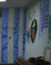
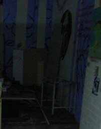
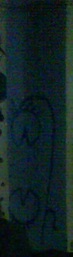
This is the only record I can find of my walls at NewQ. The blue stripes with flowers eventually continued from the three panels as seen at Halloween, around to the right with the big happy carnivorous flower, then the two tucked next to it into the small corner, entwined and sharing pollen. I do hope someone else has better photos somewhere! The walls were free to paint on so everyone else's whims encroached, and the big central panel eventually got painted over entirely, with some awful spotty mess, when TUTU took over the space. The place was a dump with masonite floors on dirt, but we loved it, painted it and laid floorboards!
Music
|
I wrote a song. Just one. It was part of a uni subject at Macquarie, where we learned nothing but how to use Cubase, a program I have never again had access to. Still, I'm happy with it, though the final mp3 compile was not as smooth as I thought the cubase file was. I listened to lots of baroque and swing, and this is what came out.
| ||
Publication
|
|
|
|
|
|
|
|
| ||||||||||||||||||
Here is the Alternative Calendar 2002, a 108 page magazine I produced for Macquarie University Students' Council. The complete file was too big to post here (and most places), so I broke it up into pieces. The 'cutepdf' attribution on the inside pages is naturally from that process, not part of the original. Thousands of people contributed reviews and several people wrote articles, compiled some reviews and/or did some layout, but most of it still came down to me.
The other disclaimer I'm compelled to add is that I was booted off the only working computer around and unable to do a final edit. I'm inordinately proud of this publication, which prompted strangers to approach and thank me for three years after, but I can't actually read it because the occasional typo lights up in neon for me and reminds me of the pain.
The other disclaimer I'm compelled to add is that I was booted off the only working computer around and unable to do a final edit. I'm inordinately proud of this publication, which prompted strangers to approach and thank me for three years after, but I can't actually read it because the occasional typo lights up in neon for me and reminds me of the pain.
Logos
|
|
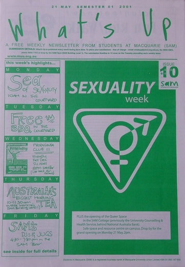
I'm hardly a graphic designer, but groups need logos so I've designed several over the years. They don't have to be slick, they have to be functional, recognisible and reproducible. Apart from the uni atheist society logos you'll find on the printmaking page, the Sexuality Collective logo was the only one which saw real use - and it wasn't even my startup! Yes they're called queer collectives now, but it was 2000 or 2001 and it was Macquarie Uni. Back then it also wasn't as easy to share images, so what you see here is someone else's reproduction, with the ill-fitting angles, inconsistent corners and extra outline.
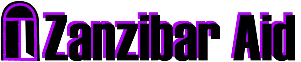
I don't know what happened to my door logo, with all those pixels falling out of line. i guess that's what happens when you make things in a hurry for a purpose then forget about them... this one was a request for a representation of a traditional Zanzibar door, which is apparently very recognisable, locally. Pity that, even like this, it outlasted the 'charity' it was meant to brand.
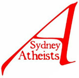
Sydney Atheists needed a logo because the previous one featured the Opera House to represent Dydney. Said building doesn't like that everyone does this, so threatened to sue everyone with a spiky shape in their logo, unacompanied by more skyline such as the harbour bridge or centrepoint tower. The red A is a bit boring, but people seem to like it, and at least I didn't merge the word with the initial, which is very hard to do without making us look unfortunately like we're theists. It was in use for a short time, before someone else got their mate to design something else, just so it wasn't mine. Fun and games!
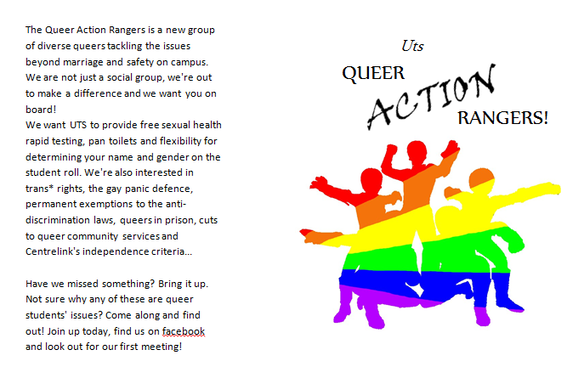
Finally, three seconds before O-week in 2013, I needed a logo and leaflet immediately or I'd lose the only real chance I had to get this group off the ground when it was needed, as the queer collective was determinedly social-only and alienating everyone but the boys. It never got up and running, but I think it prompted the existing collective to be more open to activism. So it's an artifact of its time, and should be remembered. Getting more activism to happen in queer spaces is an enduring problem that people feel alone in trying to fix, year after decade, but you're never entirely alone in an archive. I used Word as I hadn't designed things in years and no longer had access to Pagemaker and Photoshop. That old CD of the program from 1999 wouldn't even work in current computers! So it's a little terrible, but I'm rather fond of it. As with most of my stuff, in the hands of an actual designer the idea could be reformed.
I don't know what happened to my door logo, with all those pixels falling out of line. i guess that's what happens when you make things in a hurry for a purpose then forget about them... this one was a request for a representation of a traditional Zanzibar door, which is apparently very recognisable, locally. Pity that, even like this, it outlasted the 'charity' it was meant to brand.
Sydney Atheists needed a logo because the previous one featured the Opera House to represent Dydney. Said building doesn't like that everyone does this, so threatened to sue everyone with a spiky shape in their logo, unacompanied by more skyline such as the harbour bridge or centrepoint tower. The red A is a bit boring, but people seem to like it, and at least I didn't merge the word with the initial, which is very hard to do without making us look unfortunately like we're theists. It was in use for a short time, before someone else got their mate to design something else, just so it wasn't mine. Fun and games!
Finally, three seconds before O-week in 2013, I needed a logo and leaflet immediately or I'd lose the only real chance I had to get this group off the ground when it was needed, as the queer collective was determinedly social-only and alienating everyone but the boys. It never got up and running, but I think it prompted the existing collective to be more open to activism. So it's an artifact of its time, and should be remembered. Getting more activism to happen in queer spaces is an enduring problem that people feel alone in trying to fix, year after decade, but you're never entirely alone in an archive. I used Word as I hadn't designed things in years and no longer had access to Pagemaker and Photoshop. That old CD of the program from 1999 wouldn't even work in current computers! So it's a little terrible, but I'm rather fond of it. As with most of my stuff, in the hands of an actual designer the idea could be reformed.